How to Edit Yoga Videos for Flow
Master the art of pacing and transition to match the rhythm of your breath.
Craft your calm. Share your story.
Editing Tips
By Sarah Jenkins — Published October 12, 2023
Your visual identity is the first breath your audience takes when they land on your content. In the wellness space, where trust and tranquility are currency, consistency isn't just a design choice—it's a form of care.
When you curate a palette that soothes and a typeface that breathes, you signal to your viewers that your space is safe, intentional, and ready for them. Here are five rules to help you build a brand that feels as good as it looks.
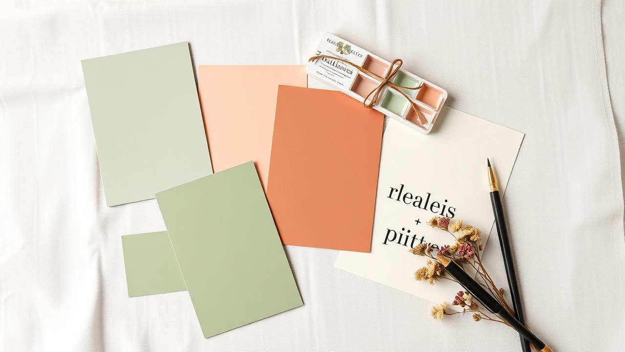
Don't chase the latest viral color. If you teach Vinyasa flow, earthy terracottas and sage greens might resonate deeper than neon lime. If you focus on sleep, deep indigos and warm creams work better than bright primaries. Your colors should evoke the feeling of your practice.
Clutter kills calm. Pick one serif for headings (think *DM Serif Display*) to give it a human, editorial feel, and one clean sans-serif for body text (think *Inter*) for readability. Mixing more than two often creates visual noise that distracts from your message.
Whether it's a subtle fade-in of your logo or a specific color wash, your opening sequence should be the same every time. This builds a subconscious rhythm for your audience, making them feel at home the moment they hit play.
It is better to post three consistent, calm videos a week than one "perfect" video once a month. Using a template ensures your pacing, transitions, and branding remain uniform, which is far more effective for building a loyal following than sporadic, high-effort content.
In wellness, authenticity is key. Don't hide behind heavy filters or over-edited cuts. Film yourself speaking directly to the camera often, and use gentle transitions. The warmth of your presence is your strongest asset.
Stop guessing with your colors and fonts. Our Brand Kit Builder allows you to upload your signature palette and typography once. Every template in the library then automatically applies these settings, ensuring your visual identity remains flawless across every single piece of content you create.
Get our curated color palette and typography cheat sheet instantly.
Master the art of pacing and transition to match the rhythm of your breath.
Why sage green calms the mind and how to choose colors that heal.
Curated audio tracks to elevate your mindfulness content.